When you are a beginner watercolor artist you might have many questions about this wonderful medium. Things like “should I use pans or tubes?”, “should I buy artist grade or student grade?”, “which palette is better, plastic or porcelain?”, and most of all, which colors should I add to my palette?
In my last blog I answered the question about watercolor pans vs. tubes and if you want you can read the blog here.
In this blog I will try to answer a few more questions.
The most important characteristics of watercolor are: Lightfastness, Transparency, Opacity, Granulation and Pigment Number.
Pigment Number
I think it’s very important to know which pigments and how many are present in the paint you want to use, at least for a couple of reasons:
1) Watercolor manufacturers use different names for paints that contain the same pigments. So if you don’t know what pigment has been used you might end up buying the same paint but which is called with a different name. For example, if you already have Winsor & Newton's Winsor Yellow Deep and a teacher in your new watercolor course tells you to purchase Hansa Yellow Deep from Daniel Smith, you would be purchasing the same paint, as the pigment for both paints is PY 65.

Pigment codes table
2) The second reason to check the pigments present in the paint is to try and purchase paints with just one pigment as much as you can.
This is because when you start mixing more than 3 pigments there is the danger of getting the famous “mud”, that is, your color becomes murky, opaque and, put simply, quite ugly.
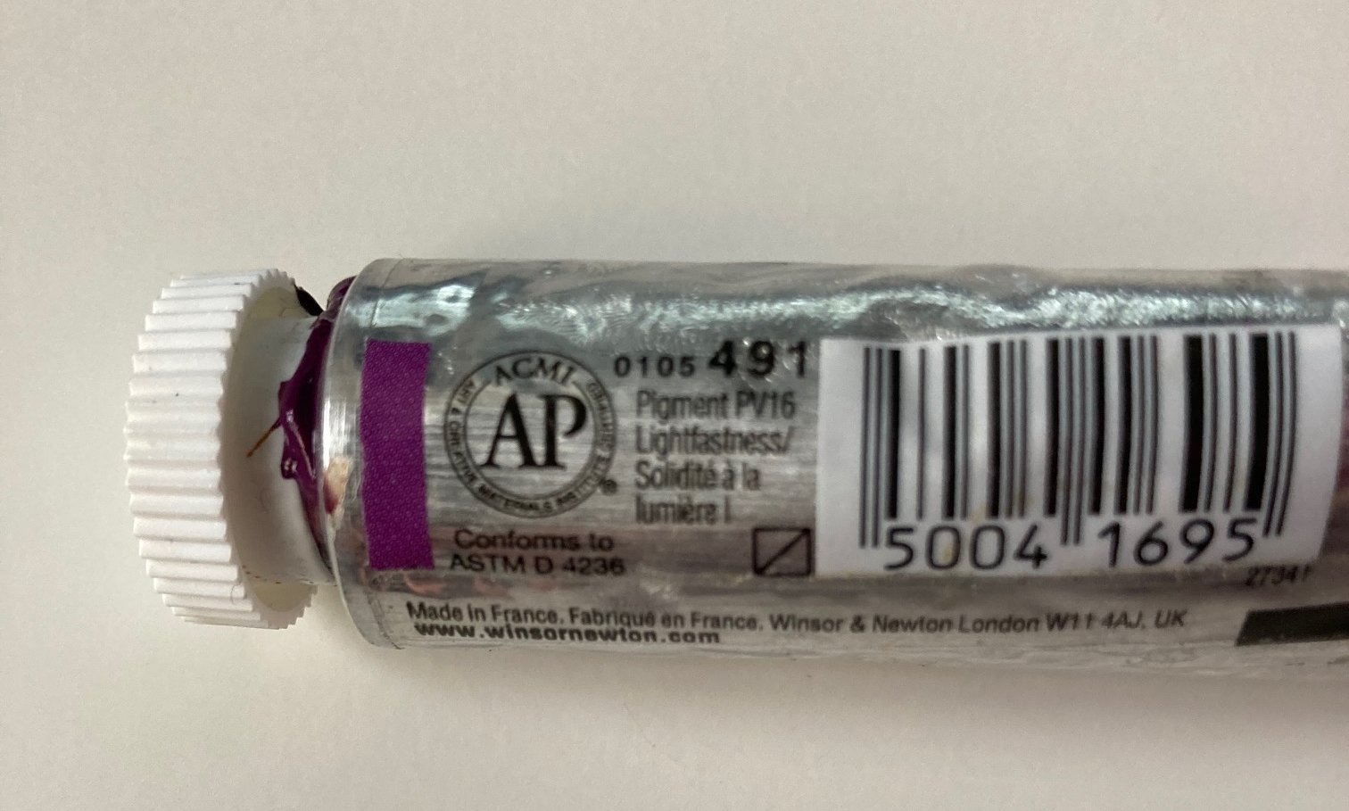
This paint contains just 1 pigment: PV16
I have explained this concept much more in depth in my Skillshare class "How to Mix Luminous Watercolors", but essentially the problem is that if you mix the three primaries (red, yellow and blue) you will end up with a neutral color (I don't like to call it mud) and not the luminous color you were after.
Quinacridone Gold from Winsor & Newton contains 3 pigments (one red, one violet and one yellow) so if you mix it with a blue you will have the 3 primaries in the mix and it will very easily turn into a neutral color.
Of course you shouldn’t be scared of using these paints, I actually rather like Quinacridone Gold, but just be aware of its composition.
Information on pigment number can be found at the back of the tube or in the little wrapping paper of the pans.
Lightfastness
Lightfastness describes how resistant to fading a pigment is when it's exposed to light.
Pigments can be lightfast or fugitive and I would avoid using the fugitive ones.
Lightfastness is indicated by symbols, the ASTM (American Society For Testing Materials) uses the roman numbers from I to V where I is very lightfast and V is very poor lightfastness.
W&N uses letters from A to C where AA is extremely permanent and C is fugitive. Sometimes lightfastness is also indicated with stars, with 5 stars being extremely lightfast and 1 star being very poor lightfastness.
I recommend using lightfast pigments especially if you want to sell original art or if you want to enter exhibitions or just simply hang the painting in your home.

Lightfastness Table
Transparency and Granulation
Transparency is one of the characteristics why I love watercolor. No other medium can give you this lovely effect of delicate light, that is why I always try to use transparent or, at least, semi transparent pigments.
You can find symbols on tubes and pans that will tell you how transparent or opaque a pigment is.
Some watercolor paints are granulating and you should be aware of this characteristic because, if you use a granulating paint, it will show in your painting.
Winsor and Newton’s French Ultramarine is a good example of a granulating paint. I try not to use granulating paints in my botanical painting, but some landscape artist love this property of some paints.
Below you can see an example from one of my class projects. If you look at the sea I’m sure you can see the granulating effect of French Ultramarine which, in this case, gives the sea some character.

Artist grade vs. Student Grade
The main reason people ask me this question is for the financial commitment, artist grade paints are more expensive than student grade.
However, there is a reason for that! Watercolor paints are made with a pigment and a binder (which is usually gum arabic), in the student grade paints there are some other fillers as well and less pigment and that’s why they cost less.
My advice to you is to but as good quality paints as you can afford. Student grade are fine if you want to play in the sketchbook but they can become muddy quite quickly, they fade faster and are less brilliant than artist grade paints.
If you spend hours on a painting you really don’t want it to fade and become dull after a short while.
Plastic or Porcelain Palette?
There are so many different type of palettes for sale that it can be rather difficult to pick one! There are plastic ones, porcelain ones, big, small, flat, with wells......
As far as the shape is concerned I can’t tell you which one to buy, that’s personal preference; what I can tell you is that I would avoid plastic palettes. They stain very easily and the color tends to pool in weird ways. I love porcelain palettes (even if they are more expensive).
These palettes don’t stain, are easy to clean and the color mixing is just a different experience.
Over the years I bought different types of palettes and I now mix the paint in wells and then use a flat palette to make additional mixes for color variations in the subjects I paint.
So I do I choose My Color Palette?
If you’re just starting out I would suggest starting with 6 primaries (a warm and cool version of each primary), then add some violets such as Winsor Violet by W&N or Dioxazine Purple by Daniel Smith, and Permanent Magenta by W&N.
I love Perylene Maroon and I use it regularly and I like some earthy colors such as Burnt Umber, Burnt or Raw Sienna and Yellow Ochre.
My palette has changed over the years and I’ve accumulated over 60 paints over many years, but the paints I’m using every day at the moment are:
Cool Yellow - Winsor Lemon (PY175)
WarmYellow - Transparent Yellow (PY150)
Cool Red - Quinacridone Magenta (PR122)
Warm Red - Quinacridone Red (PR209)
Cool Blue - Winsor Blue Green Shade (PB15:3)
Warm Blue - French Ultramarine (PB29)
Other colors I like to have in my palette are Dioxazine Purple (or Winsor Violet), Cobalt Blue, Hooker's Green and Sap Green, Permanent Rose and Quinacridone Gold.
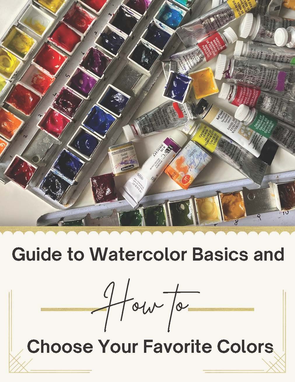
I explain more in-depth about every color I use in my short e-book “Guide to Watercolor Basics and How to Choose Your Favourite Colors”. If you’d like to download the guide you will find even more information about what I’ve been discussing here and answers to 8 further FAQs about watercolor paint.


One more piece of advice I’d like to give you is to make color swatches once you purchase your new paint. Below is an example of the swatches I’ve made from my colors. I like to do a gradient wash of the paint so I can see what it looks like when diluted, then I add the following information:

Name of the Paint
Manufacturer
Pigment number (or numbers)
Transparency
Permanency
I hope you have found useful information in this post and if you have suggestions or further questions you can leave a comment below or reach out to me directly.