Hello, my creative friends!
Today, I want to talk to you about an essential aspect of creating captivating artwork: composition.
Whether you're a beginner or a more experienced artist, understanding the rules of composition can take your paintings to a whole new level. So, let's jump right in!
1 Rule of Thirds:
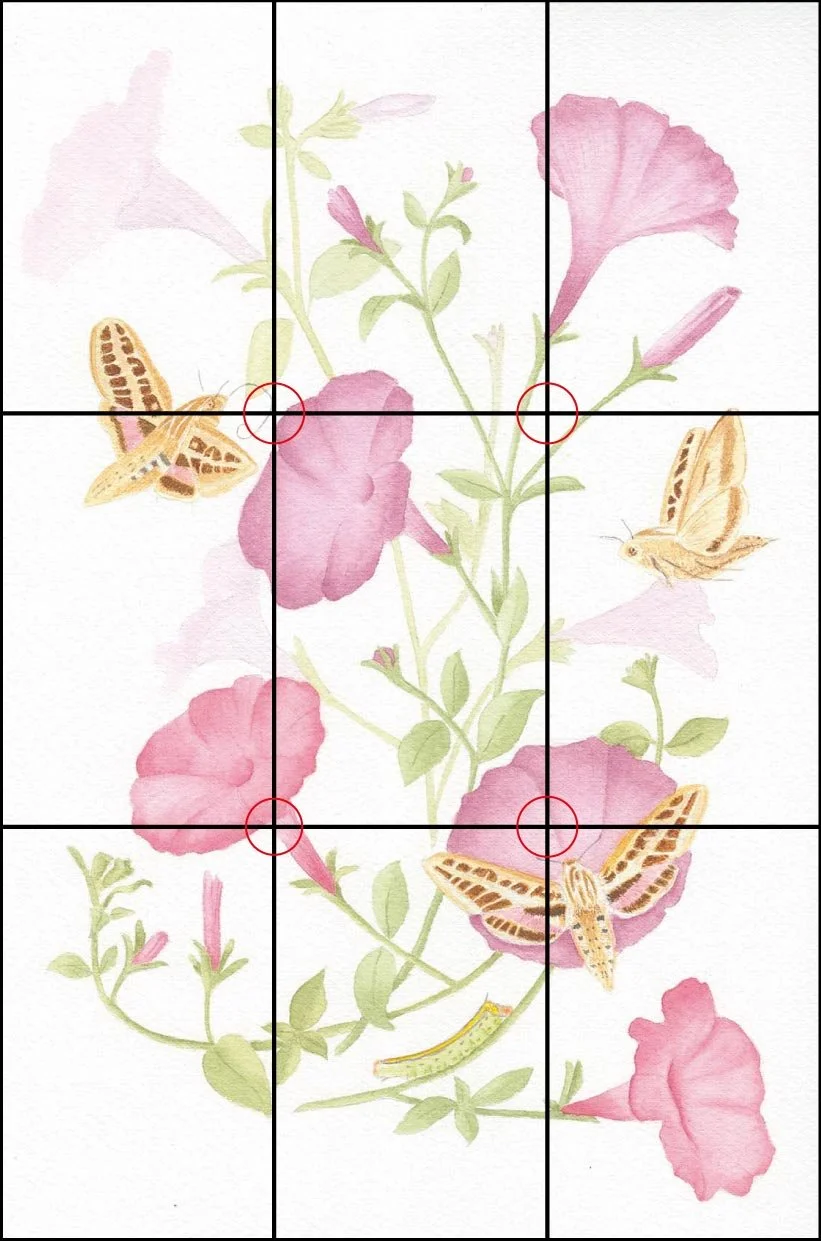
Petunia illustration
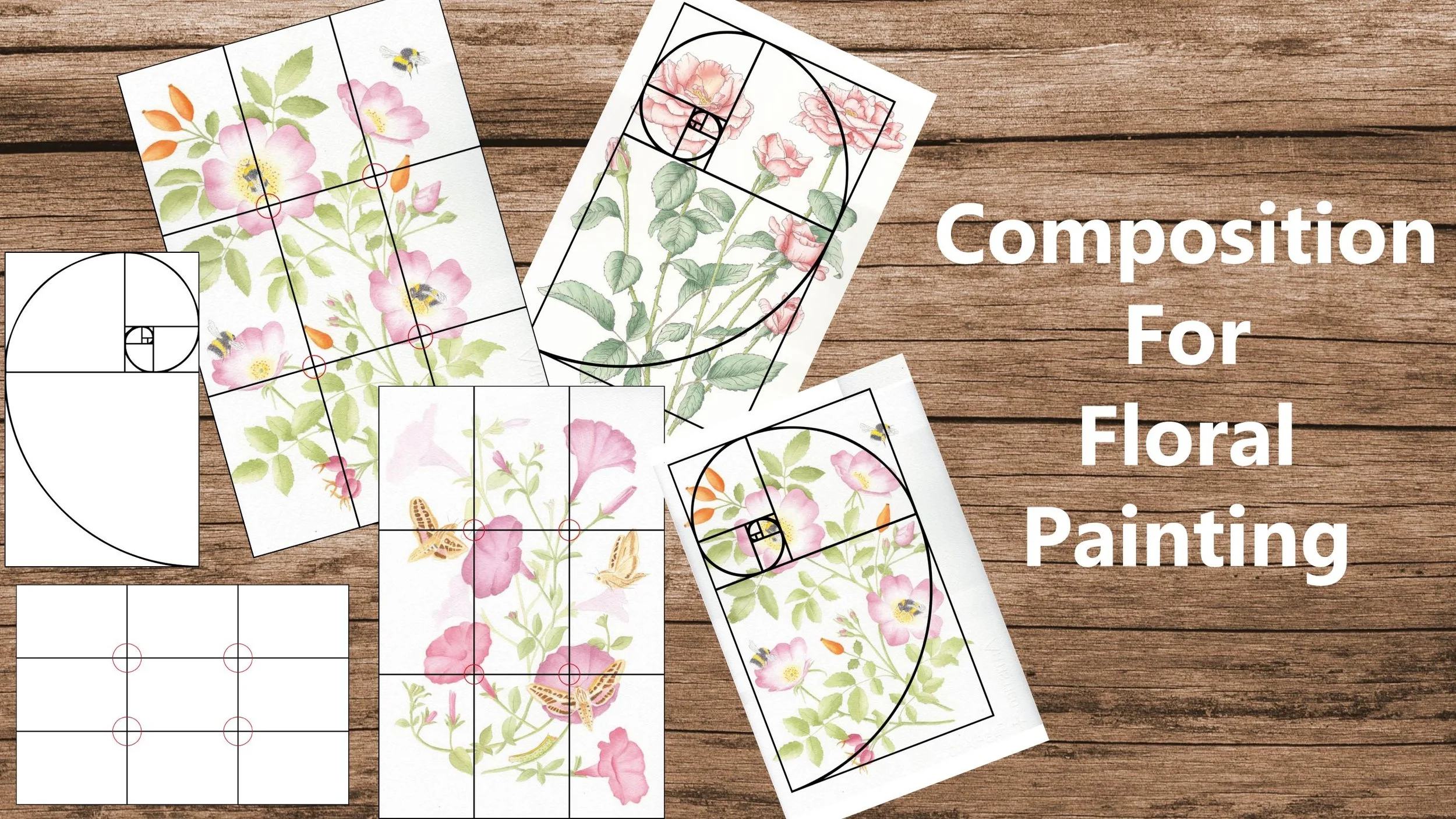
Picture your canvas divided into a grid of nine equal parts, with two horizontal and two vertical lines. By placing the focal points or elements of interest along these lines or at their intersections, you can create a visually pleasing and balanced composition. It adds a sense of harmony and guides the viewer's eye.
In my painting of the white sphinx moth with petunias, I placed the flowers and moths at the top left and bottom right intersection points.
2 Rule of Odds:
Odd numbers tend to create more visually appealing compositions. When arranging elements, try using three or five instead of even numbers. It creates a natural flow and avoids rigid symmetry, making your painting more dynamic and engaging.
3 Golden Ratio:
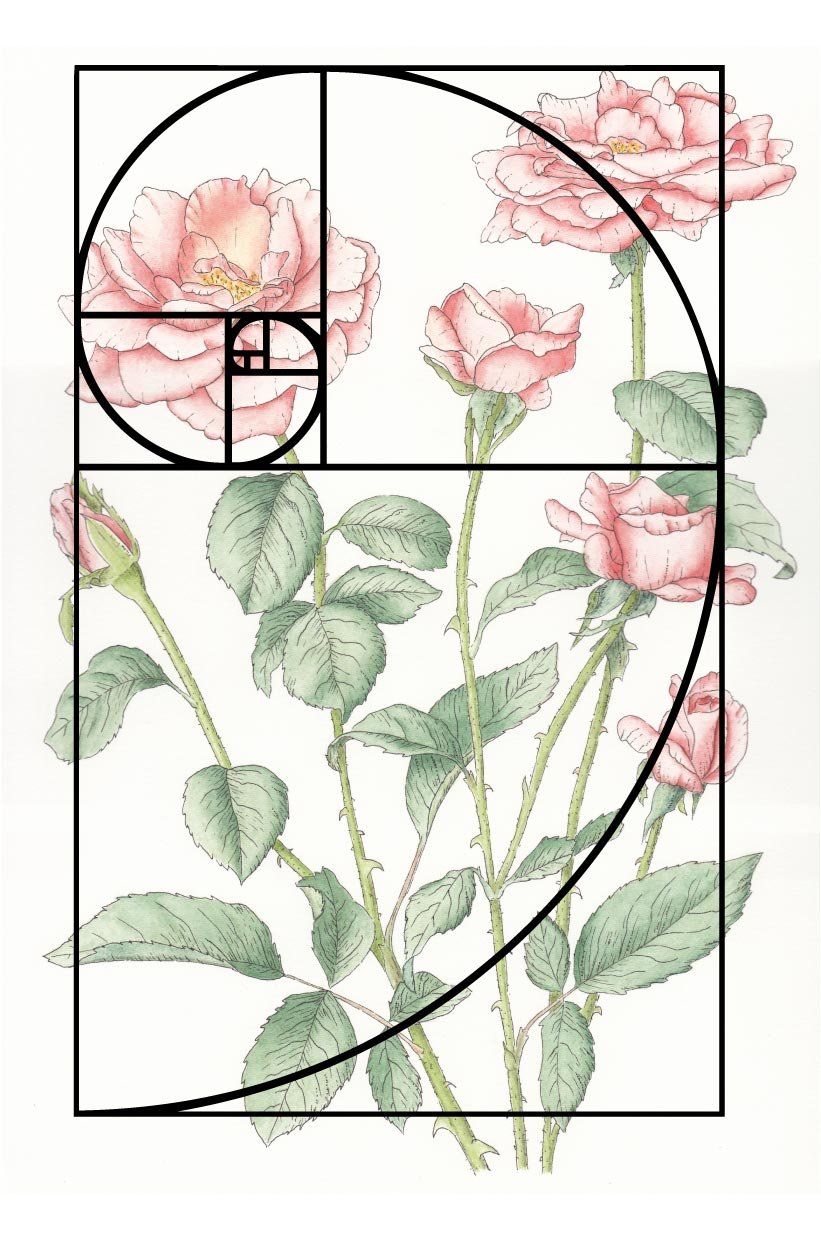
Pink roses illustration, ink and watercolor
The Golden Ratio is a mathematical concept that artists have been using for centuries (see Leonardo da Vinci). It's all about finding the perfect balance between two elements by using a ratio of approximately 1.618. You can apply this ratio to the size and placement of objects or even the overall shape of your composition.
4 Balance:
Achieving a sense of balance is crucial in composition. You can create balance through symmetry, where elements are evenly distributed, or asymmetry, where different-sized elements are arranged to achieve equilibrium. Experiment and find what works best for your artwork.
5 Contrast:
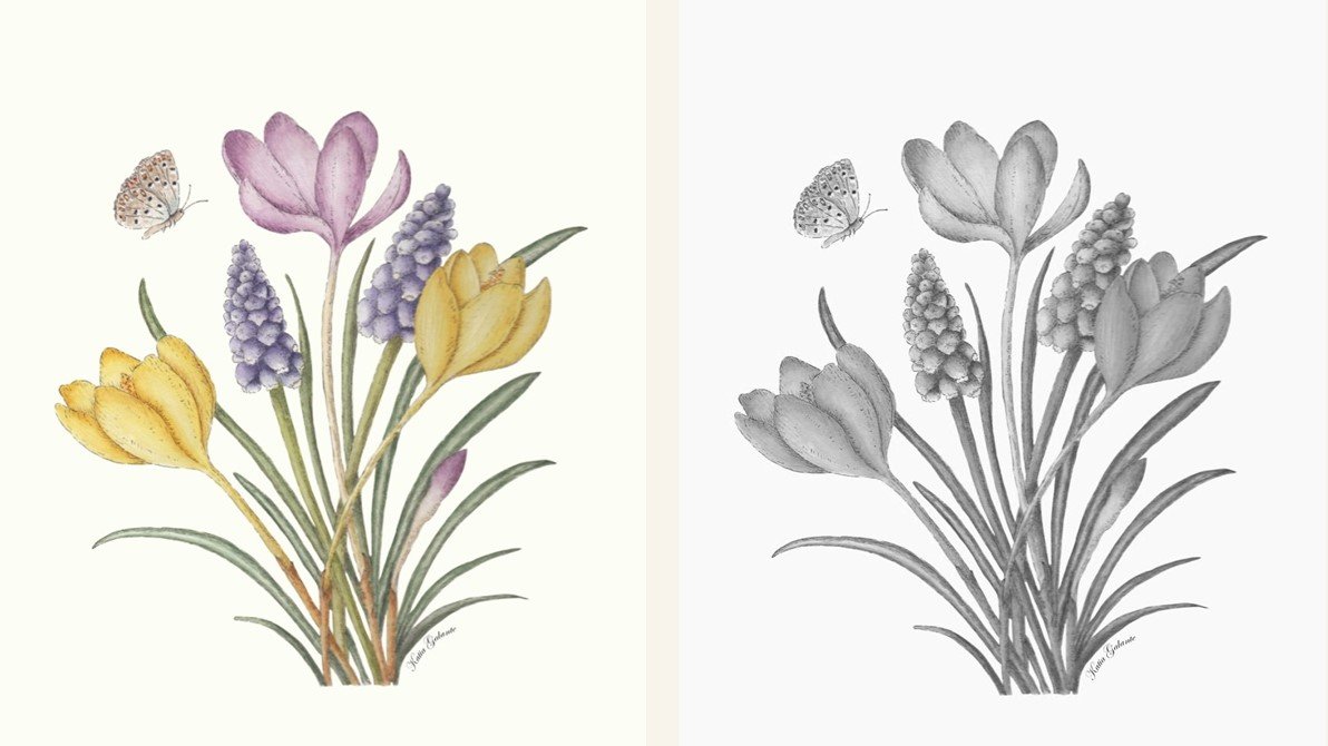
Muscari and crocus illustration, ink and watercolor
Contrast adds visual interest and helps direct the viewer's attention. By incorporating contrasting elements like light and dark, warm and cool colors, or large and small shapes, you can create a captivating composition that pops off the page.
One way to see if you have enough contrast in your paintings is to take a picture and turn it black and white. In the top image of the crocus flowers you can see there are lighter and darker areas which create contrast; in the bottom picture, although you the colors look different, when turned to black and white they are almost identical creating no contrast.
6 Focal Point:
Every great composition needs a focal point—a specific area that grabs the viewer's attention. Consider using contrasting colors, strong lines, or a larger element to draw the eye to your chosen focal point. It creates a sense of importance and guides the viewer's exploration of your painting.
7 Flow:
Creating a sense of flow in your composition helps the viewer's eye move effortlessly throughout the painting. Use leading lines, curves, or repeating shapes to guide the viewer's gaze and create a visual journey.
8 Depth:
Creating depth in a two-dimensional medium like watercolor can be challenging but immensely rewarding. Experiment with layering, overlapping elements, and using warm colors for foreground and cool colors for background to give your painting a sense of depth and dimension.
In my painting of the white sphinx moth I created depth by leaving the flowers and stems in the background less defined and lighter in color.
9 Harmony:
Harmonious compositions are visually pleasing and cohesive. Consider using a limited color palette or repeating elements or shapes throughout your painting to create a sense of unity and harmony.
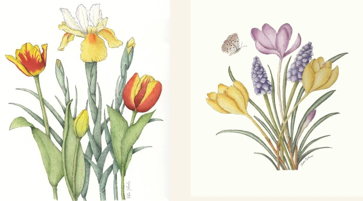
To create a harmonious composition you can use a complementary or analogous color scheme.
In the painting of crocuses on the right, I used a complementary color scheme, using yellows and purples; while it the Iris and tulips painting I used an analogous color scheme.
If you’d like to learn more about color theory and how to develop your own color palette you can check out my class: Find Your Favourite Colour Palette - For Artists and Surface Pattern Designers as a reader of my blog you can use the code Blog20 to get 20% off the class!
While these rules are essential to keep in mind, it's equally important to know when and how to break them, don't be afraid to break the rules once you feel confident in your skills. Art is all about self-expression, and sometimes the most captivating compositions come from stepping outside the boundaries.
Having said that, there are some common composition mistakes to avoid, such as placing the focal point in the center of the painting, using too many elements or too many colors, ignoring negative space and, most importantly, no kissing!
Want to know more about composition, the rules and how to break them and the mistakes to avoid? especially the “no kissing” one?
Then check out my new class: "Composition for Floral Painting."
In this class, we'll explore the principles I've mentioned today in greater detail and apply them specifically to the enchanting world of floral watercolor painting.
If you don’t have a Skillshare account you can watch the class for free by clicking HERE.
I hope you found these composition tips helpful. Now, it's your turn! I'd love to hear your thoughts and experiences with composition in your artwork. Have you encountered any challenges or breakthroughs? Leave a comment below and let's start a conversation!
Until next time, keep creating and spreading the beauty of watercolor!

